When Color Works (and When It Doesn’t)
Not every pyrography piece needs color. Simple black-and-white burns with strong value contrast (dark shadows, pale highlights) stand alone. But color elevates work that would otherwise feel flat. Detailed scenes with sky, grass, and foreground benefit from color. Portraits and animal work gain depth and life. A generic geometric pattern? Leave it alone. Color works best on pieces where you’ve already done strong burn work and are adding color to enhance, not rescue.
Ask yourself: Does this piece already look finished in monochrome? If yes, color is optional. If it feels incomplete or the details blur together, color adds clarity. Apply this rule before you buy supplies; wasted color materials cost more than a little discipline up front.
Watercolor and Watercolor Pencils
Watercolor pencils are the safest choice for pyrography because they’re forgiving and erasable before they dry. They sit lightly on the wood and don’t obscure burn detail. Apply them dry first, lightly shading the area, then dampen with a brush or sponge to blend and set. The wet application darkens the colour and spreads it into a more natural gradient. Test the hue on scrap wood first; pencil colors look different on wood than on paper, and even lighter than they appear in the tin.
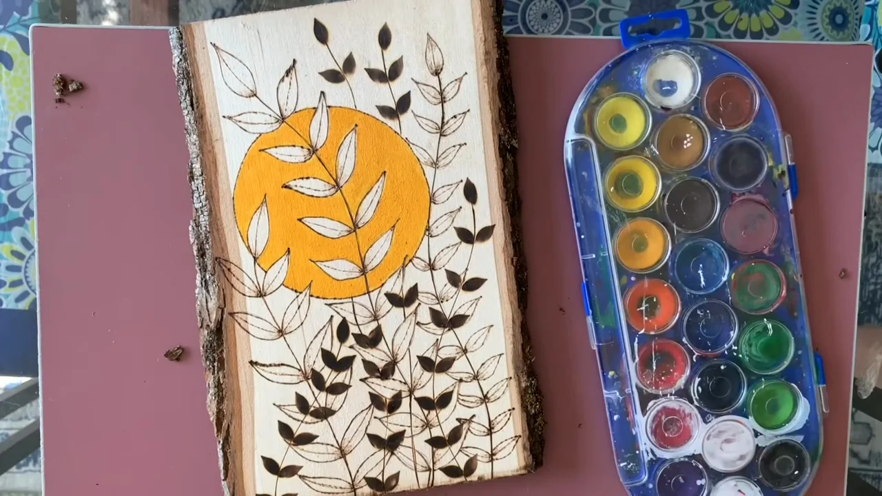
Pure watercolor works too, but it’s less forgiving. Brush application is direct, giving you less control over light vs. dark coverage. Use very dilute washes on the first pass; you can layer darker washes on top once the wood is dry. Water-based media can slightly raise the wood grain, so sand lightly after the paint dries if the finish looks rough.
Inktense and Other Soluble Inks

Inktense pencils and blocks sit between watercolor and pencil in behavior. They’re more saturated in colour than watercolor pencils but still soluble with water. Apply dry, then brush over with water to set and blend. The results are richer and more vibrant than watercolor alone. Inktense handles layering well; once dry, you can apply a second color on top without disturbing the first layer (unlike pure watercolor, where wet paint lifts previous washes).
The downside: Inktense is harder to erase once applied, and the dyes can bleed slightly into the wood if you oversaturate. Apply sparingly on the first coat and let it dry fully before assessing whether you need a second layer.
Acrylic Washes and Light Glazes
Thin acrylic washes give bold, opaque colour that sits on top of the burn rather than soaking in. This is ideal if you want the wood burning to remain visible and detailed beneath semi-transparent color. Dilute acrylics with water (aim for a milky, thin consistency) and apply with a soft brush in broad strokes. They dry quickly (5–10 minutes), so you can layer colors without waiting between coats.
Caution: Acrylics are opaque and can bury fine burn details if applied too thickly. Use thin glazes in 2-3 layers rather than one thick coat. Test on scrap first to see how the color sits over burned wood; acrylics can look muddy if the base burns are too dark or the pigment is too heavy.
Sealing Colored Work
Once your color is dry, a clear seal protects it and keeps the colours vibrant. Matte polyurethane or acrylic varnish works. Spray seals are faster and give an even coat; brush-on varnish can pool in dark burn areas and look uneven. Apply one thin coat, let it cure fully (usually overnight), then assess. A second coat adds protection if the piece will see regular handling or display in sunlight, which fades colours over time.
Test the seal on scrap first. Some water-based products slightly yellow the wood or alter colour perception. Oil-based polyurethane deepens wood tone and saturates colors, giving a warmer final look. Choose based on the mood you want; for bright, fresh colours, use a clear water-based seal.
Testing on Scrap First (Non-Negotiable)
Before touching color to your finished piece, burn a matching scrap of the same wood and test the exact materials you plan to use. Not all watercolor pigments look right on wood; some muddy, others go chalky. The burn darkness affects colour intensity; dark burns show color differently than light ones. Scrap tests take 10 minutes and save you from ruining a week’s work.
Test the combination: burnt wood + the specific watercolor/ink/acrylic + the seal you’ve chosen. This is the only way to know whether the final piece will look how you imagined. Don’t skip this step. For more on building complex pieces, see our guide to wood burning project ideas and shading techniques for layering darker and lighter tones.