Starting with a Strong Reference Photo
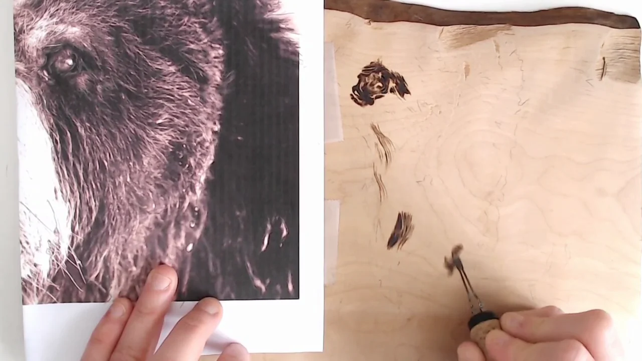
Texture work lives or dies by reference. Before you even touch your pen, spend time studying a high-quality photo of the animal or texture you’re burning. Look at the direction fur grows, how light catches it, where shadows pool, and how individual strands cluster and overlap. A blurry reference or a generic idea of what “fur” looks like will show in your work immediately.
Print or display your reference at the same size as your wood piece, or slightly larger. Place it within arm’s reach while you work so you can glance at it constantly. The more you look, the more natural your texture becomes.
Building Texture with Layered Short Strokes
Realistic fur is never a solid fill. It’s a collection of individual strokes that overlap, vary in length, and suggest individual hairs or clumps of hair.
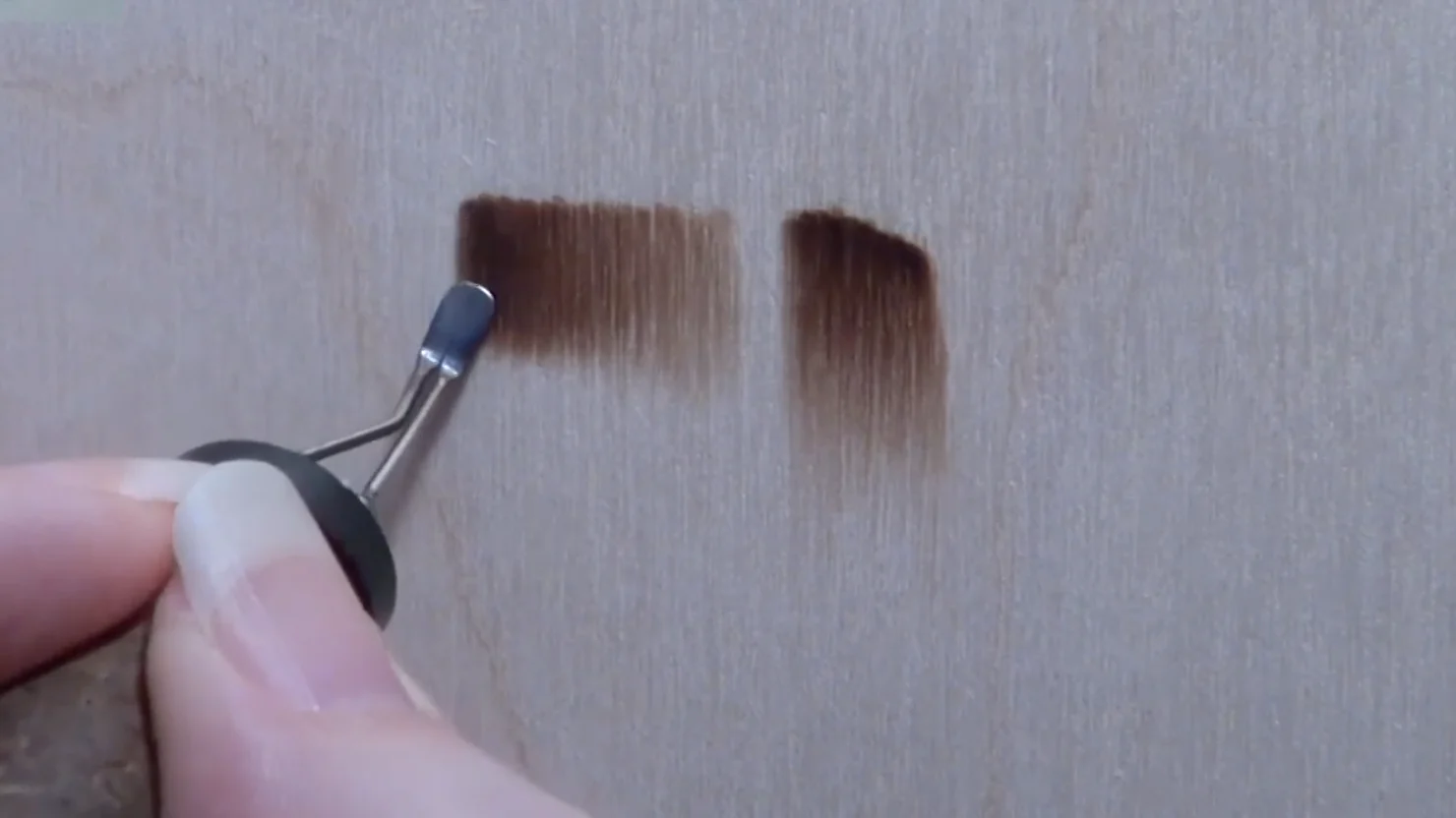
Start with a medium-heat universal tip and make short, deliberate strokes—each one about 1/4 to 1/2 inch long, depending on your scale. Lay these strokes in the direction the fur actually grows. Don’t fill the entire area with one layer; instead, make a first pass at medium darkness, then add a second layer of strokes on top, concentrating them in shadow areas and where fur naturally bunches.
This layering approach creates depth without looking painted or flat. Real fur has thousands of overlapping strands; your burn layers approximate that visual complexity.
Respecting the Direction of Fur Growth
Fur doesn’t grow randomly. It follows a grain: down the legs of a dog, across the back, longer at the ruff, shorter on the muzzle. Study your reference and commit to the direction before you start burning.
When you burn strokes against the actual growth direction, the texture reads as wrong or reversed, even if someone can’t pinpoint why. When you burn with the grain, the piece suddenly feels alive.
For longer fur (a German Shepherd or a collie), your strokes can be longer and more flowing. For short fur (a boxer or a cat), shorter, tighter strokes that sit closer together. Let the reference dictate your stroke length and density.
Building Contrast and Shadow
The difference between a flat texture and a convincing one is contrast. Real fur isn’t uniform in darkness; it’s light where it catches direct light and dark in shadow and creases.
After your first and second texture layers, identify the shadow areas on your reference. This is usually under a jaw, in the hollows above the eyes, between the legs, and anywhere the fur is thicker or farther from the light source. Darken these zones with additional, denser stroke layers. Use your medium-heat tip for this, not a blasting-hot pen that can scorch the wood black.
Highlights—the brightest spots—should remain lighter. Avoid burning them at all in a first pass; add shading around them so they stand out by contrast. A bright highlight surrounded by shadow reads as dimension.
Texture for Sensitive Areas: Noses and Whiskers
Animal faces demand extra finesse. A dog’s nose is typically dark, glossy, and highly textured. Rather than burning it solid black, use short, varied strokes to show the bumpy skin surface. Leave a small bright spot—a highlight—unburned to suggest moisture or light reflection.
Whiskers are fine, individual hairs that stick out from the muzzle. Burn these with a very light touch using your sharpest, finest-point tip. A single, swift stroke per whisker looks more natural than overlapping multiple burns on the same line. Let your pen barely kiss the wood; you’re suggesting the whisker, not scorching it.
Around the eyes, fur is often sparse and delicate. This is where slow, deliberate work pays off. Small, carefully placed strokes beat rushed layering.
Avoiding Common Texture Mistakes
Texture mistakes usually fall into a few patterns:
- Too uniform: If every stroke is identical length and darkness, the fur looks artificial. Vary it. Let some strokes be lighter, some darker, some longer, some shorter.
- Wrong direction: Fur that goes against the growth pattern reads as off. Study your reference and commit to the grain.
- Not enough layers: A single pass of strokes looks thin and scratchy. Build depth with a second and third layer, concentrating on shadows.
- Over-darkening: It’s easy to keep burning and accidentally turn delicate texture into a dark blob. Step back frequently and compare to your reference. Once you’ve reached the right darkness, stop.
- Ignoring highlights: The brightest areas are what make fur shine and feel alive. Protect them by building shadow around them, not over them.
For detailed troubleshooting of texture and other common issues, check the troubleshooting guide.
Next Steps: Moving into Portraits
Once you’re confident with basic fur texture, animal portraits become possible. A portrait combines fur texture, facial proportion, eye detail, and the subtle anatomy of a muzzle or snout. The techniques are the same; you’re just working larger and with more precision.
See the advanced wood-burning techniques guide for portrait-specific guidance, layering strategies for complex scenes, and how to integrate fine texture with shading and depth.
Practice and Patience
Realistic texture is one of the most rewarding challenges in pyrography, but it’s also the most demanding. It requires studying references closely, building layers methodically, and resisting the urge to rush. The artists whose animal work looks lifelike have often burned dozens of practice studies before attempting a full portrait. Give yourself that grace. Burn a few texture studies on scrap wood, compare them to your reference, and refine your stroke technique before committing to a final piece.