Choosing the Right Font
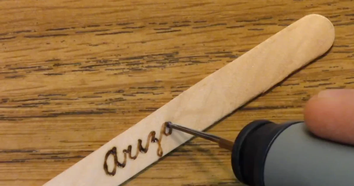
The font you choose makes or breaks lettering. Thin, delicate fonts that look great on paper are a nightmare to burn without wobbles or broken strokes. Bold sans-serifs (Helvetica, Arial, Futura) are your friends, especially when learning. They have thick strokes that forgive slight hesitation and pressure variation. Script fonts are tempting but demand high skill and perfect tip control; save those for after you’ve burned a dozen alphabet practice sheets.
Rule of thumb: If the font’s strokes are thinner than a ballpoint pen line, it’s too fine for wood burning. Test your chosen font on a piece of paper at actual burn size before transferring to wood. If it looks shaky or unclear on paper at that scale, it will burn worse.
Transferring Text Cleanly
A bad transfer ruins the burn before you even start. Blurry lines, smudged graphite, or text that’s too faint force you to burn over a vague outline, leading to uneven strokes. Use graphite transfer paper (the dark, waxy kind) and press firmly with a smooth tool, not a ballpoint pen, which leaves deep indentations. For small text, I recommend chalk transfer or a light pencil on sanded wood; graphite shows clearly without being too dark to burn past.
Pro tip: Transfer your text 20% larger than you think you’ll burn, then either reduce your pen size or lower the temperature slightly. This cushion gives you room to adjust as you work and prevents the common mistake of burning text too small and tight to read. For more detail on transfer methods, check our guide to design transfer techniques.
Choosing the Right Tip for Lettering
A round solid-point tip is your workhorse for lettering. Wire nibs are too wide for clean, defined letterforms unless you’re burning very large text. For small letters (under 1.5 inches tall), a fine solid-point gives you precise control. Medium-width tips work for letters 1.5 to 3 inches. The key is matching tip size to letter scale: the tip should comfortably fit within the letter’s thinnest stroke, so you’re burning the outline cleanly without the tip’s sides creating halos. For more on tip selection, see our review of wood burning pens.
Stroke Order and Direction
Burn letters the way you’d write them with a pen: top to bottom, left to right. This prevents your hand from smudging already-burned sections and gives you a clear view of what you’ve done so far. For letters with strokes that cross (like A or H), burn vertical strokes first, then horizontals. This sequence lets you see the letter taking shape and adjust pressure or angle for the second stroke.
Consistency is everything: Set your pen temperature and work steadily through all your text with the same settings. Switching temperature mid-alphabet creates visible tone shifts that scream “amateur.” If a letter looks too light, you can always make another pass after all text is done; it’s easier to darken than to fix an overburned letter.
Fixing Wobbles and Uneven Lines
A shaky letter usually means either too-low temperature (you’re pressing to compensate), fatigue in your hand, or you’re moving too fast and losing control. Lower the heat slightly and slow down. A confident, steady burn at medium speed beats a rushed, pressured one every time. Rest your forearm on the wood (not on the letter itself) to stabilize your hand. If you’re right-handed, orient the wood so you burn left to right; this keeps your hand steady and prevents dragging it across wet burns.
Light wobbles can be hidden by making a second pass over the same letter after the first one cools, this time with a fraction more pressure. The second pass darkens the letter and smooths minor irregularities. Major wobbles are unfixable; accept them as a learning moment and move on rather than over-working the letter and making it worse.
Adding Decorative Borders
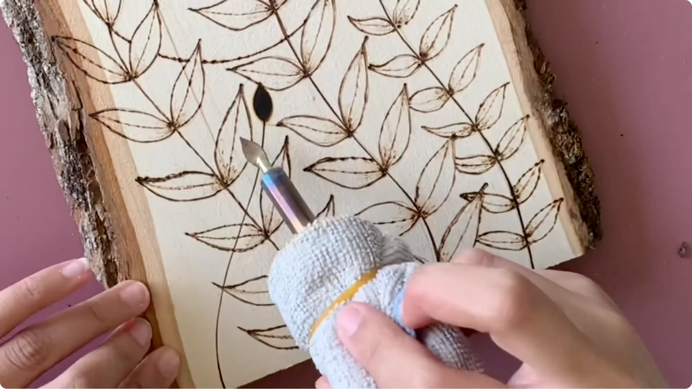
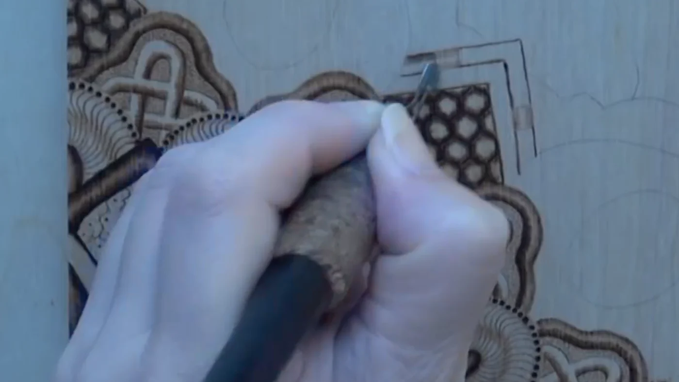
Borders frame lettering and give the piece a finished look. Simple geometric borders (straight lines, corner flourishes, or a basic rectangular frame) are easiest. Keep them light compared to the text so they don’t compete for attention. A thin line around the text perimeter, set back slightly from the letters, balances the weight without overwhelming.
If you’re feeling adventurous, small decorative elements (dots, leaves, or simple repeat patterns) spaced evenly around the text work well. Practice borders on scrap wood first. Consistency matters here too; a wobbly or uneven border looks worse than no border at all. The border is the last thing you burn, after all text is done and cool, so you can assess spacing with fresh eyes.